Print – And Its Place in the World
We looked at print place in the world today and if can really compete with the digital age. Is print a thing of the past, or is this actually the f...
Published on August 20, 2021
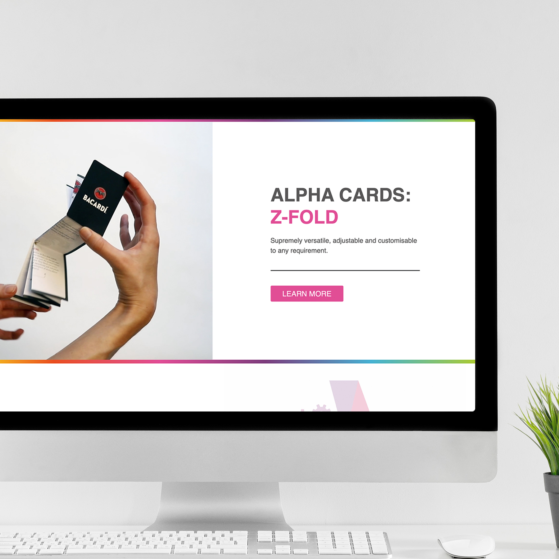
Take advantage of our design services if required, but if you’re designing your own Z-Fold card, check out our top tips below. Ensure that your design goes as smoothly as possible and your final product has that ‘wow’ factor you’re looking for. Our Z-Fold card offers endless solutions in different cover and inner sizes. They provide a large inner area that is ideal for maps, campus guides, product and service marketing, brand building, event schedules, and direct mail needs.
Consider what you are using your new Z-Fold cards for. Are you using them for internal company communications? Maybe you’re using it for advertising space to promote a variety of businesses? Whatever you’re using the insert for, size matters. We offer a large range of sizes and some will be more suitable for your application than others.
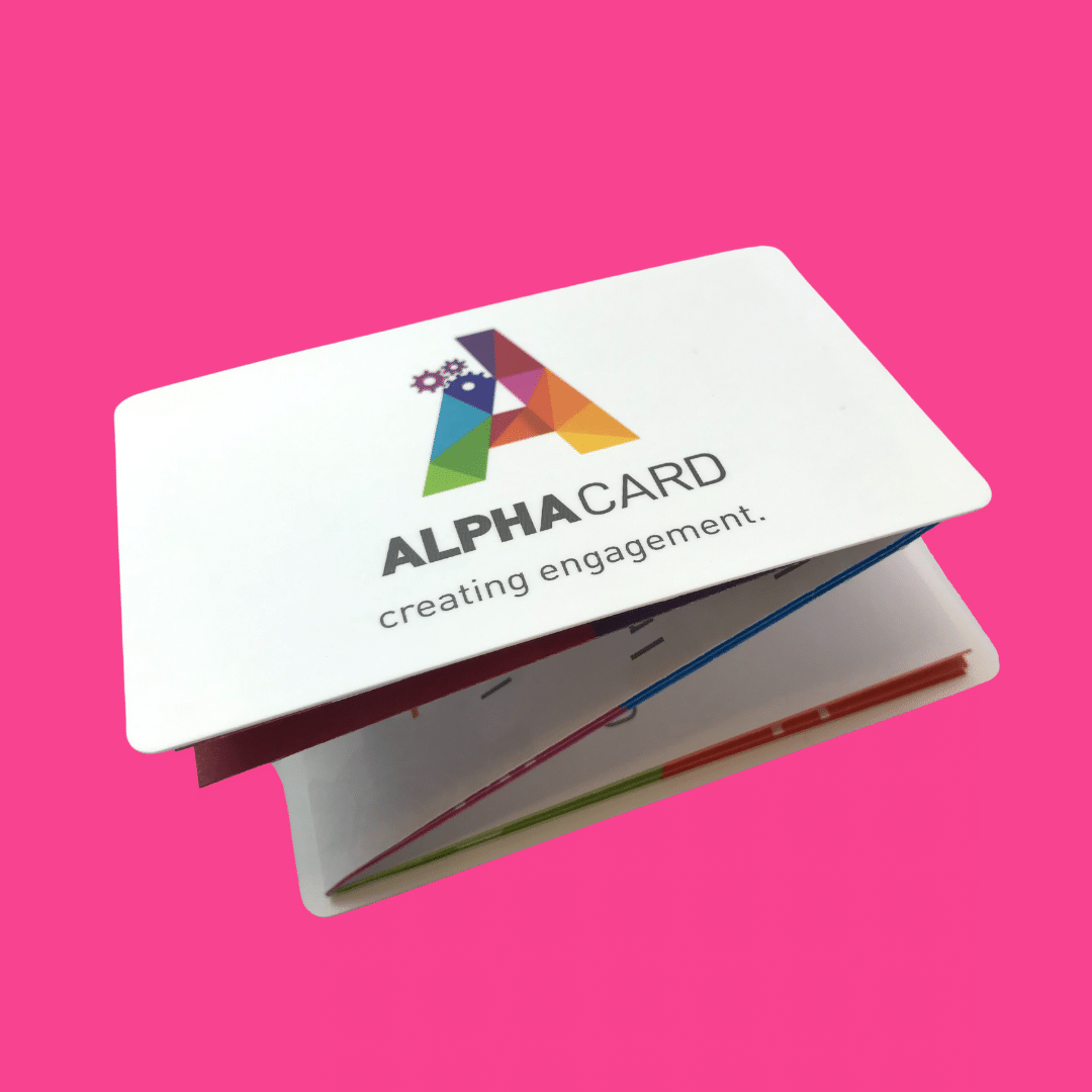
If there is a lot of content involved in your design, we would recommend a larger Z-Fold inner as opposed to the concertina fold. Each of the standard cover size options, Mini, Credit, Pocket, Jumbo and Handy can have inners ranging from 3 to 13 columns for the Z-Fold, dependent on cover size. A lot of content can be overwhelming and lack clarity but the range and versatility of our cover and inner combinations provide a number of options to choose from.
We are happy to help guide you through the process with our extensive experience and knowledge, so please don’t hesitate to get in touch.
From the start, it is important to consider how the content flows throughout your Z-Fold card. How many columns and rows you’ll include in your final product will make a big difference to your overall layout. If you’re opting for one row, which is known as the C-Fold, then you may consider using each panel separately. However if you’re using multiple rows, it works well for your design to flow over onto the various panels.
Your content and text may need to be broken up into manageable chunks, you can easily use space to do this and make your design look more visually appealing.
One last thing to consider is that your covers will be on opposite sides if you’re using an odd number of columns. This works well if you have content in two different languages for example, but not so well if, perhaps you want one side to contain a map or event layout and the other advertising or a conference schedule.
Combining print and digital is a great way to increase brand awareness and drive traffic to your online channels. Check out our previous blog for more in-depth information on how to do this, but a few quick methods include; adding your social handles on your print, including QR codes that lead people to specific pages of your website or maybe to your online shop, or including QR codes that lead to engaging videos of your services or products.
Your font size should be set to size 12 or above to be absolutely sure that it is easily readable. Small text in large quantities can be very off-putting to your audience. Larger and well-spaced text will always work better at keeping your audience engaged.
If you’re looking to print your covers in black, we recommend using an overall UV Varnish coating, rather than laminate. This ensures there is no lifting.
Please remember that all images need to be of a high resolution. This will be pointed out to you if there are any issues throughout our proofing process.
We print lithographically using 4 color process (CMYK). However we can print using special, fluorescent or metallic inks if you’re looking to make your Z-Fold card even more eye catching! (Our products are printed in accordance with ISO colour standard 12647-2.)
A gloss or matt laminate or overall UV varnish is applied to the covers as standard. But if, for example, you need the ability to write on a cover then consider a machine seal instead. We have a selection of other finishes that can really make your print stand out and make your design even more engaging. Spot UV varnish, foiling and embossing and Die Cut shaped covers such as bottle hangers, are just a few.
Other options to consider are; tabbing closures, especially useful for magazine tip-ins, flow-wrapping, useful for combining two products or when enclosing with food products, perforated panels on the inner, ideal for driving redemption and particularly applicable to our 2-row format.
Please note before sending us your artwork it needs to be supplied as a PDF file with crop marks and 3mm bleed. No artwork should be in the darker blue shadow areas of the covers on the inserts.
To get your Z-Fold templates, get in touch with us here. Or to order your free sample packet to get further inspiration for your own project, click here.
Did you find this blog helpful? If so please give it a share!

Blog by Content Marketing Agency | Search Buddy – Digital Marketing Agency in Leeds
We looked at print place in the world today and if can really compete with the digital age. Is print a thing of the past, or is this actually the f...

Learn how you can use print marketing to elevate your success and tell your brand's story with our blog. Create a lasting relationship with your cu...
What is a z fold card? Z fold cards are a way for businesses to create full-size printed marketing campaigns that easily fit into the pockets of th...
What is direct mail? Direct mail is a print marketing method that has stood the test of time. It is one of the longest running forms of known marke...

Did you know that print marketing is still the number 1 preferred information resource for tourists according to a survey conducted by Bentley’s Ce...
Take advantage of our design services if required, but if you’re designing your own Z-Fold card, check out our top tips below. Ensure that your des...